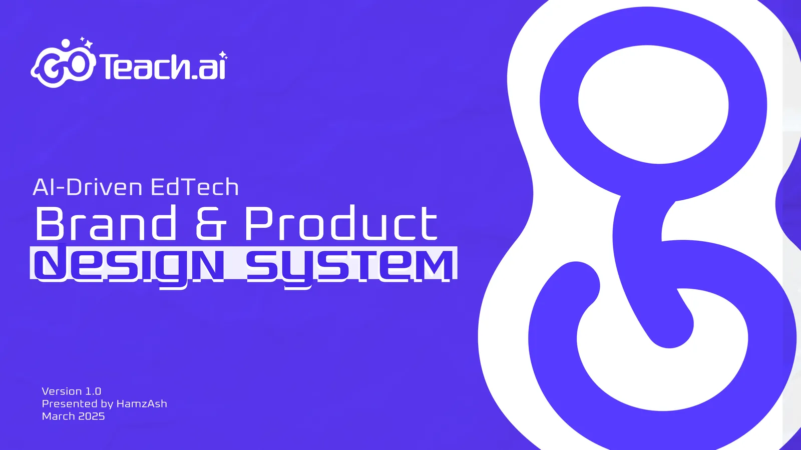
GoTeach.aiAI-Driven EdTech Brand & Product Design System
2025
Year
Brand Identity · UI/UX
Discipline
7 deliverables
Scope
A brand system, a UI/UX design system and the core product screens, all built from one visual language
A brand system from zeromascot-led logo, three primary tones plus accents, dual typefaces, clear-space rules
A nine-pose mascot castso the identity can answer what a screen is saying, not just appear on it
Brand extended into a UI systemcomponents, a two-style icon font, shadows, an interface palette, a full type scale
Core product screens on itlanding page, auth flows, and a TEKS-aligned worksheet dashboard, grades 3–8
Shipped and launchedthe system carried from brand identity through to a live product in market
CASE01
What they came with
Mehul (the same contact as Uplift K12) brought me onto a second project in that relationship: GoTeach.ai, an AI-driven EdTech platform for teachers. The idea was smart tools for lesson planning and classroom engagement, centred on a syllabus maker and an auto-generated, TEKS-aligned test-prep library across grades 3 through 8.
GoTeach.ai started with nothing built: no logo, no colour system, no visual language. And the brief had a tension in it. The platform had to stand out in a crowded, AI-saturated EdTech market without reading as cold or purely technological. Teachers are the primary user, and a tool that leans too hard on "AI" risks feeling impersonal to exactly the audience it is trying to win. The identity had to hold technology and humanity at the same time.
Nothing to start from, and a line to walk.
CASE02
How I built it
The answer was a mascot-led identity rather than a purely typographic mark: the word "Go" turned into a friendly, glasses-wearing character that reads as approachable rather than robotic. A face is the shortest route to warmth in a category that mostly signals intelligence, and it settled the technology-versus-humanity tension in the mark itself rather than in the copy around it.
The wordmark given a face: "Go" as a character.
That mascot became the anchor everything else was built around. Colour, typography and clear-space rules were all defined so the mark stayed legible and consistent at every size, from a favicon to a letterhead.
Full lockup and symbol, down to a favicon.
Rather than stopping at a brand manual, the same colour and typography system was extended directly into a full UI/UX design system (components, icons, shadows and an interface-specific palette), so the product and the brand collateral around it could never read as two different companies.
CASE03
What shipped
Seven things came out of it, and each one is built on the one before rather than beside it.
Brand identity & logo system
The mascot carries the brand’s core idea: a character built from the "Go" wordmark, given a face, glasses and a posture library rather than left as a static shape, because a teaching tool should feel like a presence in the room, not a piece of software. The primary logo pairs it with the wordmark and the tagline "Teaching Meets Innovation"; a symbol-only mark covers what the full lockup cannot fit. I defined clear-space rules for every variation.
Colour and typography
Colour is built on three primary tones (Deep Blue #2D10DD, Vibrant Purple #5A38F6 and Dark Gray #39393A), plus accents (Pink #FF69B4, Teal #A1E3D8, Yellow #FEC601) reserved for energy and highlight moments rather than core brand surfaces. That reservation is the whole point: the accents keep the palette warm without tipping it into a children’s toy brand. Typography splits logo from body use: Quadaptor-Regular carries the wordmark, Oxanium handles everything else.
Three tones, held-back accents, two typefaces.
The mascot cast
A nine-pose character set, with different expressions and gestures, gives the brand something to draw from across marketing and product moments. One static illustration pasted everywhere it appears stops being a character after the second time you see it; a cast can respond to what the screen is actually saying.
Nine poses, so the brand can answer the screen.
Brand collateral & stationery
I applied the identity across physical and digital touchpoints (laptop and smartphone splash screens, letterhead and envelope design), so the system had proof it worked somewhere other than a logo lockup on a white background.
Design system for the product
Underneath the product UI sits a full component library: inputs, radio buttons, checkboxes, toggles, primary and secondary buttons, all built to the same visual language rather than browser defaults with brand colours dropped on top. I built an icon font in two parallel styles, rounded and square, so a matching pair exists whichever style a screen calls for. A shadow system gives cards and modals depth without borders, and a type scale from Display 10 down to Display 1 covers hero headline to fine print.
The system under the product: components, an icon font in two styles, and the shadow ramps.
An interface palette on top of the brand one
Brand colour and interface colour are not the same job, so the system carries both. On top of the core palette sits an extended digital set for interface use: Purple Magic, Purple Blue, Cyan/Teal and Blue, each with its own tints and shades, plus a neutral grey scale. That gives the product room to express state (hover, active, disabled, error) without reaching outside the brand’s own colour language.
Tints and shades: state stays in the brand.
Product UI/UX
The landing page leads with "Master Your Test Preparation" and lays out the platform’s core value props (PDF generation, progress tracking, TEKS-aligned content, custom assessments, smart search and subject coverage), followed by an available-subjects grid and an FAQ. Registration includes a teacher/student account-type toggle, since the platform serves the two roles differently and needed to route each into the right experience from the first screen.
The full scroll, and the two panels it opens on.
Teacher or student, chosen on the first screen.
The core of the product is the Practice Tools dashboard: a subject- and grade-filtered library across STAAR Math, STAAR Reading, STAAR Social Studies and Bluebonnet Math, grades 3 through 8. Each worksheet card shows its TEKS learning objective, a live HTML preview so a teacher can check the content before committing to it, a downloadable PDF, and quantity controls for printing. The filtering is what makes a large library usable rather than overwhelming.
Filter first: never the whole library.
CASE04
Where it landed
GoTeach.ai shipped as one system rather than a logo in isolation: brand identity, a full UI/UX design system, and the core product screens (landing page, auth flows, the Practice Tools library), all drawn from the same visual language, so nothing read as bolted onto a separate brand exercise.
Mark, colour, mascot, product — one language.
The identity and the interface were never separate pieces of work. The interface palette extends the brand palette, the component library uses the brand type scale, and the mascot appears in the product rather than only in the marketing. That is the difference between a brand a product carries and one it is painted in.
Hamza has incredible talent with design. I highly recommend his work!
This conversation is recorded and shared with Hamza Ashraf so he can follow up personally.
Ask me about Hamza's services, pricing, process or past work. I answer from what is on this site. For anything that needs a decision, I will point you to him.
Answers come from this site. For a quote or a start date, message Hamza.


 Uplift K12 / GoTeach.aiView on LinkedIn